BOOKS FOR YOU TO READ
AND DOWNLOAD
- TELL ME IT'S TRUE ...
A Book Of Poems by Stan Schmidt - SOMETHING IS GREATER THAN WONDERS...
A Book Of Poems & Free Verses by Pastor Harold Brokke - Gems of Truth by Stan Schmidt
- Where In the World Is God? by Alec Brooks
- Light of the World, an Original Screenplay by W. G. Orr
BACK ISSUES
- E-mail your articles and book-length reports to thirumalai@bethfel.org or send it by regular mail to:
M. S. Thirumalai, Ph.D.
6820 Auto Club Road #320
Bloomington, MN 55438 USA - Your articles and booklength reports should be written, preferably, following the MLA Stylesheet.
- The Editorial Board has the right to accept, reject, or suggest modifications to the articles submitted for publication, and to make suitable stylistic adjustments. High quality, academic integrity, ethics, and morals are expected from the authors and discussants.
Copyright © 2001
M. S. Thirumalai
THE COVERS OF CHRISTIAN FICTION
Madasamy S. Thirumalai
1. ENTICING THE BUYER, ILLUMINATING THE SPIRIT OF THE BOOK
Attracting the attention of a prospective reader/buyer and persuading him to buy the book is a major function assigned to a book cover. This demands a portrayal of such items in visual form and in verbal language, which, from the point of view of the book cover designer, would induce a likely reader to buy the book. Our aim here, however, is not to focus on such matters but to study how an artist has visualized the spirit of the book in its cover and how in this visualization process he has added to or modified or deviated from what he aimed at portraying. It is the fit between the artist's work and the content of the book in verbal language that is focused here. In the age of increasing interdependence, it is likely that some aspect of the book cover may be designed by others, not fully by the artist himself. It is also possible that such cooperative participation in designing the cover may precede the actual designing process, be concurrent, or follow. We will not focus on such cooperative acts. We will look at the cover as a finished product and treat it as a single and unified whole. We will seek to identify the structural organization of the cover (the front cover, to be precise) and relate it to the relationship between the artist's work and the verbal content of the book.
The scope of this study is on the front covers of the novels published by Bethany House Publishers. The covers under analysis and discussion here were largely done by Dan Thornberg, a staff artist of the publishing house. For want of time, and since this is only a preliminary and informal study trying to identify the general features and types, I have used only 48 covers published until the early part of 1990s for the study presented here. The later part of the 1990s has seen tremendous developments and changes in the design and presentation of Christian fiction covers. One of the major developments is the significant reduction in the verbal description of the content of the book. (Perhaps the assumption is as follows: The new generation of readers cares little for the verbal and seeks more attractive visualization, instead. And the trend-setting publishers and artists, forced by the competition, quickly adopt the "successful.") Certain innovative methods of lettering have been adopted. However, even now the basic elements that we notice in the covers stem from the earlier practices adopted. Sometimes,one notices some disturbing trends of much give and take between the themes and designs adopted in Christian publishing including fiction covers brought out by different publishers. In this competition to "look alike," and to adopt and appropriate the "successful" efforts of other publishers and artists, at times originality becomes the casualty.
2. THE TWO SIDES OF THE COVER: Their Relative Functions
It is common knowledge that a cover, indeed, consists of two parts - the front and back pages/covers:
- The front page is the one which, naturally, is dominated by the visual whereas the back page is generally assigned to verbal description.
- While this may be the general rule in Bethany fiction (and in fiction published by others as well), there is an attempt also to present a visual or a part of the visual in the back page in a size smaller than the visual spread in the front page. This is what has been resorted to and accomplished in The Presence and several other covers.
- There is yet another variation - a part of the visual in the front page could be reproduced in a much smaller scale (as in Beyond the Shadows) or as an actual size reproduction of a part of the front page visual as in A Woman Named Damaris.
- Yet another variation has been to reproduce "passport" size portrait of characters, neatly framed and presented as in Treasure of Stonewycke (3).
- Yet another variation is to treat the front and back pages (rather back and front, following the left to right writing system convention adopted in the Roman script) pages as a single canvas for a panoramic view.

Although I have identified five different structural approaches to increasing the function of the back page, I feel that in the Bethany cover such structural approaches (especially b and e are less frequently resorted to and thus these form part of the compulsion to be distinctive and original on the part of the artist/designer. A cover demands conventionality, mostly dictated by the publishers and their assessment of the expectations of the potential buyers. This constraint, a necessary evil I should confess, however, needs to be overcome by any genuine artist. I believe that Dan Thornberg has succeeded in overcoming such extraneous factors by the right method of innovation, which adds to his conception and practice of art while at the same time making the cover more attractive to the potential buyer.
3. DAN THORNBERG
Dan Thornberg, a theology and missions major graduate of Bethany College of Missions in Minneapolis, has been the In-house artist of Bethany House Publishers, a leading Christian fiction publisher in the USA, for many years. He has designed and drawn numerous covers and has taught courses in evangelism and several Bible books including the Book of Job at the college. His gifts were discovered years ago by the missions-oriented community, Bethany Fellowship International, in Bloomington, MN who founded the Bethany House Publishers as their ministry arm to spread the gospel around the world. Dan's talent is the grace and gift of God.
4. THE VERBAL FUNCTIONS OF THE BACK COVER
To go back to where we began, the front page mostly for the visual (or visual like representation in writing) and the pack page mostly for the verbal communication is bound to be a universal practice in books published in languages, which adopt a left to right writing system. In fact, this practice comes to define what is a front page and what is a back page. A Bethany cover assigns a dominant verbal function to the back page and a dominant visual function for the front page, even as it retains a small dose of verbal function for the front page. A mosaic is what a Bethany cover is. And yet there are very important distinctive roles assigned to the verbal part in both the pages.
Whereas in the front page the verbal part has the role of illuminating and/or adding on to the information conveyed by the visual, the visual part does not play an equitable role in the back page. In fact, I have not seen any direct relation between the visual and the verbal in the back page. The verbal generally ignores the visual in the back cover, and has its reference most of the time either to the visual in the front page or to the (verbal) content inside of the book.
The relationship between the verbal and the visual here is neither over inclusive nor restrictive in its scope; it is rather disjointed. (This is proof for me that the place of the artist in the back page is small indeed.) In general, the back page is for the verbal and the front page is for the visual. Perhaps the publishers intend that what could not be presented or what could be presented only briefly in a medium should be presented or extended in another medium in the back page.
5. THE STRUCTURE OF THE FRONT COVER
The Bethany front cover may be viewed as consisting of four zones of communication - the title, the author, the visual, and the verbal narrative (the verbal description). The dialectic between the various pairs of combination of these four zones of communication is an interesting phenomenon to watch in any cover, more so in the Bethany cover, for, the part of verbal narrative (verbal description) is generally avoided in secular fiction. However, when a work of fiction is intended for a targeted population, such practices are quite common.
The four zones of communication are in a dialectic relationship in the sense that these can be variously placed within the cover space and this placement brings out information in a unique manner for a particular cover. (We will take up the placement characteristics a little later.) However, it is the three zones of title, author, and visual that have mobility in the cover space in relation to each other, in reference to one another, whereas the verbal narrative can be placed anywhere - the verbal narrative performs its function as if it were independent; it derives its inherent coherence and an independence from the unavoidable constraint that it should follow the rules which govern composing any thought in the verbal language.
In other words, the title, author, and the visual could be tampered with in some fashion, rather "tinkered with" in some fashion; the verbal narrative would not allow such rearrangements of its constituent 'bricks'. If one wishes to maintain better comprehension, it should not split, nor can its elements be so widely separated from one another. The verbal narrative is generally moved as a single unit, is made to maintain its alignment, and order. The moment it is subjected to the types of tinkering that could be performed on the title or the author or the visual, it loses its characteristic of being a verbal narrative and becomes a mere display/artwork. Since it aims at the illumination of the visual and a brief description of the content of the book, and since it inevitably accepts the constraints of the writing system (which demands certain uniformity in the size of the letters, spacing between words, etc.), it has a domain of its own. From its domain (and without involving itself in an exchange of spaces with the other zones of communication) it can directly enter into a dialogue with the other zones, especially the zones of the visual (most of the time) and the title (sometimes).
5. INFORMATION/COMPLEMENTATION
The dialectic between the other three zones of communication (the title, author, and the visual) is influenced by the variables of location in space and the degrees of prominence (through color scheme, size of letter/visual, the quantum of space occupied, the angle of occupation, extension to the back page and/or the spine, etc.) In the case of the script-based zones of the title and the author, it is the degree of the size and the style of the letters involved (we ignore for the moment the color scheme which is prominently/frequently exploited in the covers of the novels presented as a series) that generally assigns relative importance to them.
Often the title has a greater prominence (and a greater occupation of space) than the author. However, the prominence of the author may be restored and emphasized through using a different color scheme for the author's name, a color scheme different from that of the title. It may also be achieved by using a different letter style and arrangement.
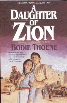
Yet another characteristic I notice is the regularity in the dialectic between the two (the title and the author) sought to be imposed and maintained in the series. Consider, for example, The Zion Chronicles (A Daughter of Zion and The Zion Covenant (The Jerusalem Interlude). The author is placed below the title in the former, whereas in the latter, the author is placed above the title.
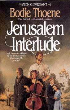
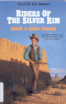
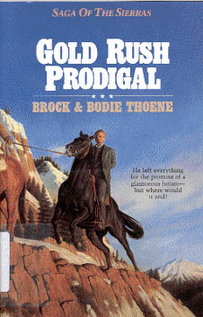
Note here that the placement is not at issue; giving a personality, a fixed design of features of identification to the series is the issue. (I would consider that, from this angle, the covers of the books of the Saga of the Sierras Series have not been as well conceived as the covers of the books in some other series. Compare the possible identity confusion between the covers of the Riders of the Silver Rim and Gold Rush Prodigal in the above series).
Thus the title and the author, each assigned an important role, are to be seen only as a part of the superimposed concept, the Series. The author and the title continue to hold on their own, but they could do so only within the constraints of the series design. The ultimate goal of the front cover in a series is thus distinct from the ultimate goal of a book, which exists on its own. In many ways, the front cover of the first book may influence the covers of subsequent books in the series. Accordingly, a designer generally allows himself some room for future maneuvers. However, when a new artist begins to design subsequent books, certain problems of conceptualization, style of representation, etc. may arise., We shall discuss these issues when we consider certain specific covers in a later section of this paper.
7. THE PLACEMENT FUNCTION OF AUTHOR
Let us now consider the placement of the author in the front cover. There are three ways in which the author is placed:
- Immediately above the title.
- Immediately below the title, and
- Not as an integral whole as in 1 and 2.
The placement of the author above the title is less commonly used than the placement of the author below the title. This may or may not signify the relative importance between the two - although it appears to me that when the novelist is read (in comparison to when the novel is read), the novelist appears to occupy the placement immediately above the title. This does not mean that it is followed as a general rule. For example, several of Janette Oke's novels (especially the earlier ones and the sequels) have the title first, followed by the author. On the other hand, in Bodie Thoene's works, interchange of place between the two signifies a distinction between the series. What is most important to note here is that the arrangement/combination - the author followed by the title - is never resorted to when both these items are given in the lower half of the front cover. In other words, the author immediately above the title is assigned to or marked with the role of the upper half of the front cover.
The only exceptions to the above-identified pattern seem to be The Crown and the Crucible, The Gentlewoman's Choice, and Song of the Silent Harp.
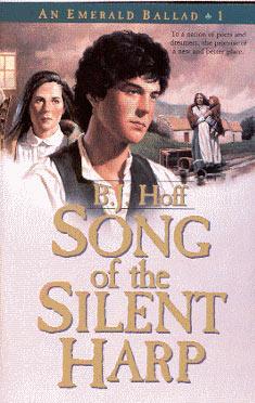
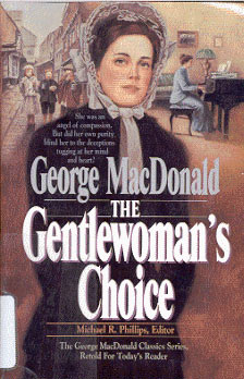
Note, however, that in these apparent exceptions, the author and the title in that order occupy the entire lower half, not just the end of the lower half (that is, the last one-third of the front cover) as in all books, which have the title followed by the author presentation. In addition, these three front covers present a visual with a more panoramic view than others. (It is a panorama of a different sort, which we will discuss when we come to the discussion on content portrayal).
The third placement of the title and the author is to separate them as different/distinct entities (treat them not as an integral whole), allowing the insertion of a visual between them. Consider, for example, The Peace Maker.

The author is presented in bold, followed by a narrow strip of the visual, soon to be followed in bold (in fact, occupying almost the lower half of the cover) by the title. Or consider another variation in Treasure of Stonewycke in which the title in bold follows a broad "panoramic" visual over which the author (s) is imposed almost at the end of the front cover.
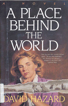
Yet another variation (technically it is not different from the above) is found in A Place Behind the World, wherein the title and the author are separated by a large visual, and an insert toe the large visual just above the author is made, giving the impression that the gulf between the title and the author is occupied by two different sets of visuals.
In a way, it looks as a general rule that the author and the title, or the title and the author could be separated by a visual that gets all the prominence in all the splits. Compare the front cover of Power of Pinjara with that of Love's Fragile Flame.
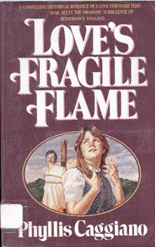
In the former, the arrangement is as follows - the author is followed by the panoramic visual in the upper half of the entire lower half. In the latter, the artist reverses the order - the title occupies the upper half in bold, followed by an "episodic" visual and the author in the lower half. Impressionistically speaking, just as I have been doing so long in this paper, the placement of the visual on the upper half of the front cover appears to be more eye-catching. No conclusion can be arrived at on this aspect because it is not the placement that influences our assessment of the relative qualities of these two covers here - the Pinjara cover appears to have been executed with greater finesse and color than that of the Fragile Flame. To arrive at the decision on this aspect of placement, I would rather look for two covers where everything else is under control except the placement of the visual; that is, when except one variable, all others are under control, we may be able to assess their artistic efficacy in surer terms for our purpose. The point, however, remains that when the author and the title function as a single unit, the sequence title and author only is to be preferred, when they are presented in the lower half. When they are split by an intervening visual into separate units, there could be an interchange of places - sometimes the author would occur on top and sometimes the title would occur on top. But, when the split occurs, the prominence is no more with the title or the author, but is assumed by the visual most of the times in the following order:
- The author and title as a single unit
- Author first and title below
- Title first and author below
- Upper half may be given to both a and b, but
- The lower half (rather the lower third) is given only to b
- The split of the author and title into distinct units
- Intervening visual is an essential instrument for the split
- Reversal of the order is possible and is followed
8. AUTHOR VERSUS THE VISUAL AND THE VERBAL
What relationship holds between the author and the other two zones of communication, namely, the visual and the verbal narrative? We have seen that together as a single unit, the author and title have some placement relationship with the visual. Together as a unit, these do not have any placement relationship with the verbal narrative. That is, the single entity (of author and title) comes to life only in the actual/real spatial dimension and in the spatial dimension it extends its relationship to the visual.
The whole relationship, between the author and the title on the one hand, and visual on the other, is spatial, the patterns that govern the use of space in the front cover. Only when they are separated into distinct units either actually in space in the front cover or mentally in the viewer, at least on of the entities (the title) comes to have relationship with the verbal narrative. In other words, the author as an individual unit is not seen to be having any relationship either with the verbal narrative zone of communication or with the visual zone of communication in the front cover. However, there are two exceptions - a distinct verbal narrative may be inserted to highlight the author in terms of (a) the authorship of another book or (b) in terms of the classic nature of the book being presented. (See and compare the verbal qualification of Bodie Thoene in Vienna Prelude, "Best Selling Author of Zion Chronicles, and "The George MacDonald Classic Series, Retold for Today's Reader" in The Gentlewoman's Voice). In general, the dialectic is between the author and the back cover, and not between the front cover and the author. The verbal narrative proper in the front cover does not have any relationship at all with the author zone of communication.
9. THE TITLE VERSUS THE VISUAL AND TEH VERBAL NARRATIVE
Let us now consider the title. We will not go into the appropriateness of the title given. That is another interesting area of communications research, with variables ranging from marketability to faithfulness to and representativeness of the content as well as the intent of the work and the author. Our focus here is restricted to identifying the relationship the title holds between it and the other three zones of communication in the front cover.
To begin with, just as the author zone, the title zone extends over to the back cover in many ways, but its strongest function is in the front cover. That is, unlike the author, which has its elucidative moorings more frequently only in the back cover, the title has a role both in the front and back covers. Secondly, its strongest bond is both with the visual and the verbal narrative. (Remember that the author has only a minimal relationship with the verbal narrative and no relationship at all with the visual). There is a small or minimal relationship sought to be established also between the title and the additionally inserted verbal narrative focusing upon the current title's relationship with a previously published title.
Compare the narrative inset "The Sequel to the Gates of Zion" in A Daughter of Zion. That is, whereas the author establishes a link with the books of another series or an entirely unconnected book, the title generally links itself to a connected book within a sequel. The difference in the exploitation of the inserted verbal narrative distinguishes thus the author and the title variables more significantly here. As I stated above, this is only a small function. The greatest demand on the title is to illuminate the verbal narrative and to get illuminated by the verbal narrative.
In general, the front cover aims to make a fit between the visual, the verbal narrative and the title. What are the ways in which it is being achieved? Does the artist have anything to do with this communication process between the verbal narrative and the title?
10. THE ENTICING QUESTION OF THE VERBAL NARRATIVE: A SOLILOQUY OF AN OBSERVER
The verbal narratives played a crucial part in the design of the front cover until recently. Progressively we see that the covers designed these days do not have a verbal narrative, an enticing introduction and curiosity raising question. However, there are quite a few covers designed even today with the verbal narrative in the front cover.
We should first recognize the fact that both the title and verbal narrative operate within the language medium. Here two choices are made from the language medium - diction, and the use of curiosity eliciting question form. It is not the tag question that is used. It is not also a question that demands an answer. It is a question inviting you to see the answer for yourself. It is not a quiz-type question either. It suggests something, hides something, and leaves the answer for you to find for yourself. It is a soliloquy of a different sort - a soliloquy of an observer, not a participant.
Consider, for example, the verbal narrative in The Lady of Stonewycke: "Confused and alone, she traveled halfway around the world to discover her roots. Would she survive the truth?" Consider also, "He had captured her heart, but he didn't seem to want it�Would the tragedy help him realize the truth?" in Anne.


Either the pronoun (usually the third person) or the personal name becomes the focus by which an event of the past and/or the present is implied. The future is left out to be guessed. What gives the narrative an interesting aura is its foregrounding of the content. All of a sudden, a character or event is pulled out and foregrounded. From nowhere the character or event appears to strike a cord in us and to arouse our curiosity.
11. A QUESTION OF FORETASTE
I must confess that this is a technique often used in the movies of the past, especially the trailers (previews) of the movies to be released. It was a "bioscope" technique, which perhaps had its origin in the then contemporary theater. I must also confess that this technique of having a verbal narrative is not generally used these days except when one wants to bring to the foreground an aroma of the past and of the parody. The Bethany cover takes this technique of presentation seriously, exploits it to the advantage of a seller/promoter even as it does, in a way, do justice to the buyer - should not a buyer have a foretaste of what he is going to buy?
12. OTHER FORMS OF VERBAL ENTICEMENT
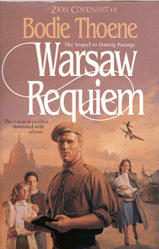
Two additions I must make here as regards to the form of the verbal narrative. While most of the verbal narratives end or begin with a curiosity arousing question form, some of the narratives are straightforward descriptive statements, not involving the question form at all. Consider, for example, "He came seeking a new life; but what he found was raw trouble", in Riders of the Silver Rim; "The voices of children threatened with silence" in Warsaw Requiem.
(Incidentally note the opposition between voices and silence. Very rarely, and to me it appears to be the first time, such opposites are used in the verbal narrative in the Bethany cover. Note also that when such oppositions are created, the verbal narrative may attract the attention to itself without reference to the visual zone. But, then, should we have such an independent zone, or should we have a series of dependent/interdependent zones? The possibilities raised in these questions open up further avenues of freedom for the cover designing artist).
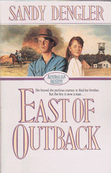
Another form used is to stop the sentence halfway through, keep it open-ended, suggesting a progression of events, mobility, not a stagnant posture - "She braved the perilous journey to find her brother. But the boy is now a man�" in East of Outback.
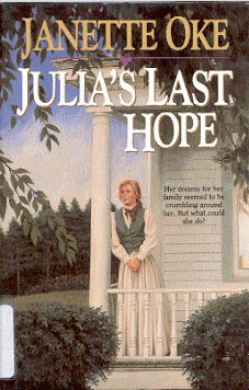
Within these three types, there could be several variations. For example, a preceding sentence in the verbal narrative could stop open-ended halfway through. The final sentence may be placed on a word to bring out a significant point (as in Julia's Last Hope).
These and others (not listed here) are variations within the three major types already identified.
13. ON THE STRUCTURE OF THE VERBAL NARRATIVE
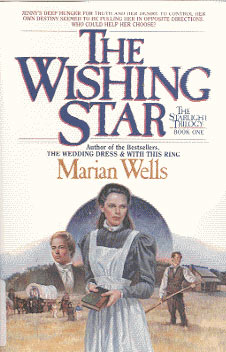
The verbal narrative consists of two sentences (maximum), from six to twenty-four words, or just putting together a few phrases ("One Threat�One Plan�One Chance�" in The Peacemaker). In most cases, we seek to keep the sentence length under control, and, in some, one notices a very long involved construction. For example, consider the sentence, "Jenny's deep hunger for truth and her desire to control her own destiny seemed to be pulling her in opposite directions. Who could help her choose?" in The Wishing Star.
The structure of the first sentence reminds one of a report. It is true that most of what we get in these narratives is a report, but to present it using a structure of conjunction often found to be used in formal reports robs the sentence of its emotive content.
In some cases, such as On the Trail of the Truth, the communication is exclusively between the title and the narrative, with the visual playing a minimal role.
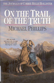
When one reads the verbal, he may not find it illuminating the visual. The use of the word truth in the narrative links it with the title directly. (There may be some linkage with the visual through the association of trail in the title and steps in the narrative; but this is not pronounced.) The visual can be extended to cover the trail and/or the steps, but not the truth. There is some disjointed communication. In general, for the verbal narrative to be strong in communication potential, it should have a manifest relation with the visual. Otherwise, if our focus is on the verbal narrative only, then, the verbal narrative must be composed differently. On the Trail of Truth is an exception. In most cases, the fit between all the three is obvious and it becomes a matter for great relish.
15. A FITTING QUESTION
How is this fit brought about? First of all, a fit between the visual's emotive value and the emotive word in the verbal narrative.
Consider The Lady of Stonewycke once again:
The verbal narrative says, "Confused and alone, she traveled halfway around the world to discover her roots. Would she survive the truth?" While the entire verbal narrative captures the mood of the visual, it is the words confused and alone that are directly linked to the visual. The rest of the content of the verbal narrative ("she traveled halfway�") is the addition imposed on the front cover by the verbal narrative. The mood is fully captured by the visual, and additional information is supplied by the narrative. Not that the words confused and alone are easily derived from the visual. Anchoring on to the visual in a discernible manner through the use of select diction and then extending the net further is basic trait of the Bethany cover.
Now let us consider the verbal narrative in Riders of the Silver Rim. "He came seeking a new life; but what he found was raw trouble". The raw trouble cannot be understood and appreciated without the visual zone. Whereas in the former (The Lady of Stonewycke), the function of the verbal is to extend the information of the mood, the visual in the latter gives the verbal its meaning - it is not just an extension, it gives life to the verbal. In a way, the visual has a much greater localization here and the verbal takes on an idiomatic expression, an expression deliberately not concretized in the verbal.
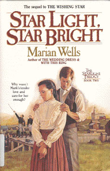
Take yet another front cover, the front cover of Star Light, Star Bright.
The verbal narrative reports, "Why wasn't Mark's tender love and care for her enough?" The narrative here states a present condition while asking "why?" The answer, however, is provided by the visual. This is different from the second type listed above. In the second type, an equation between the verbal and the visual was sought, which led to an illumination of the former by the latter. In the present type, however, no equation is aimed at. An implication is aimed at.
16. VISUAL CONCEALMENT: THE LINK BETWEEN THE REPRESENTED AND THE UNREPRESENTED
It is necessary for me to make a digression at this point. In traditional Indian poetics, the analysis of the essentials of poetry had led to the conclusion that 'the contents of a good poem may be generally distinguished into two parts. The first part is that which is expressed and which includes what is given in so many words; in the other part, content is not expressed, but must be added to the poem by the imagination of the reader or the listener. The unexpressed or the suggested part, which is distinctly linked up with the expressed and which is developed by a peculiar process of suggestion, is taken to be "soul" or essence of poetry�the very essence of a poem is that which is not even expressed, some form of symbolical speech in which wisdom demands that one should express oneself more in hints and suggestions than in actual words was always in vogue, and the poets had been more or less partial to the method of speaking in metaphor or wrapping up their ideas in transparent allegories. But the suggestive poetry is something different from the merely metaphorical. The metaphorical or the allegoric, however veiled it may be, is still in a sense expressed and must be taken as such, but the suggestive is always unexpressed and is therefore a source of greater charm through its capacity of concealment, in which consists the essence of art, is in reality no concealment' (Thirumalai 1985).
When applied to visual art, this principle could lead to extremes, obtuse and abstract levels. And yet the basic principle remains valid in our experience of literary and art sensibilities. Perhaps the front cover of a book, especially when it is intended to be sold to a group of practical people, cannot afford to be a place for obtuse and abstract pieces of art. Fortunately for us, Thornberg captures the spirit of suggestion in a manner that adds an exquisite dimension to his art and an exquisite feeling to our sense. This is precisely what happens in the front cover of Star Light, Star Bright. The verbal narrative presents a question "Why wasn't Mark's tender love and care for her enough?" and the visual answers it. If the verbal narrative alone was there in the front cover, there was no suggestion; there would be no extension of the communication process. The visual takes from where the verbal left and there is an implied suggestion, and an implied answer to the verbal question. No suggestion and no answer in the verbal itself; the visual presents itself with suggestive power. The visual and the verbal media handle a single unit of information, but apportion the parts and functions differently. Here a complementary role is played by each of the media.
17. THE SCOPE OF THE VERBAL NARRATIVE
A significant characteristic of the verbal narrative in the front cover is that the very same cover could be over inclusive in some respect and too narrow in some other aspect, all bundle up together within the same narrative in Anne's front cover: "He had captured her heart, but didn't seem to want it. Would the tragedy help him realize the truth?" (Italics mine).
The mention of tragedy for which no clue is available in the visual is an example of over inclusiveness; on the other hand, the house in the background in the visual, so prominent and well set, does not have any clue at all in the verbal narrative. In other words, what was visualized as important for a purpose by the artist was not important enough for the verbal narrative, and yet the possibility of complementary exchange of roles between the two bring out a more wholesome perspective to the front cover. (This does not mean that I insist upon retaining the verbal narrative as an essential part of the front cover; my purpose here is to point out how functionally the two perform well in the front cover. The justification for the verbal narrative in the front cover should be sought in the complementary roles it could play in relation to the other zones of communication in the front cover. When a verbal narrative fails to demonstrate this role, it should have no place in the front cover.)
17. FRONT COVER AS AN INDEPENDENT ARTWORK
The visual is the soul of the front cover, but can the visual in the front cover exist all alone as a work of art, just as any other work of art by a painter? In the hands of a true artist, even the visual in the front cover can and will assume the personality of a true piece of art. And yet there are many constraints imposed on the artist and finished product of art, by the determining variable "front cover". A chief constraint is that the visual perform the function of identifying and associating itself with the content/identity of a concrete object, the book. A visual in the front cover can exist on its own merit as a work of art and could still be enjoyed as a work of art. However, when it has to perform the function of labeling something specific, it loses its moorings as a pure work of art.
There is yet another way to look at the matter, which I think is more appropriate. The work of art in the front cover has a different function and thus demands a different set of rules for its appreciation. Even this explanation would not satisfy one to call the visual in a front cover a work of art in the same sense in which a painting by a painter (done on his own without the constraint above) would be called. This is an inherent disadvantage to the true artist who devotes a major part of his/her life to do front covers.
A parallel is seen in the careers of well-known cartoonists, those peddlers of twisted faces and bodies and retrievers of true information! From hackwriting (rather hackcartooning), one evolves his own style and imposes his personality on whatever he does. Ultimately it is the evolution of the person into an artist that will give meaning and significance to whatever he does. The artist soon comes to have his imprint in many ways - it could be the way he adds to what the writer has done - adding, deleting, modifying and canceling out. Faithfulness to the time of events, faithfulness to the personalities portrayed, then becomes the minimum on which the artist builds his own edifice of art.
Whereas the content of a book is deadweight in so far as actual creation of art, it does have the function of motivating the true artist, so long as the book is by a truly creative writer. The artist has to put up himself with this deadweight and still do his best to swim actively, so that it is seen clearly, rather perceived and felt, that the artist has an independent role. For many, this independence is viewed only as an impressive portrayal of the content of the book.
For those who have a discerning perception, the front cover becomes a window to the heart of the artist - the design features of the front cover space, the placement of the episodes and characters and environment, and the interpretive personality given to all three by the artist are all available then to the discerning viewer. Soon the artist's imprint begins to change the dependence on the episodes, characters and environment of the content of the book into an independence, well organized in the artist's own world. A peddler of twisted faces and bodies becomes a true artist when he becomes also a retriever of the intent, the true intent (of the twisted faces and bodies). Likewise a front cover artist manipulates the limited space of the front cover, and the episodes, characters and environment to free himself and his art from a total dependence (surrender?) on the content of the book.
18. SIGNIFICANCE OF THE FRONT COVER AS AN ARTWORK: THE BONDAGE
A work of art is a joy forever; it encourages and kindles in us so many independent interpretations; the viewer is free to interpret it in his/her own way and imagination. There is not much of an additional or specific constraint. A work of art certainly signifies something; if not, it at least kindles in us an urge to see something in it or feel something for it. But when a work of art represents something that exists outside (or has a bondage to something else, such as a painting portraying a known episode, or character, etc.), the significance the artwork carries is guided in a more concrete manner. A similar situation prevails within the space of the front cover, in a relatively more explicit and bonded manner between the visual and the content of the book. (Here the content includes the title, the author, and the verbal narrative also in the Bethany cover.) So the function of the visual in the front cover is to guide us to the content of the book.
19. FRONT COVER AS AN ARTWORK: NO LITERAL REPRODUCTION
Does it mean, then, that the artist simply reproduces the content? Literal faithfulness to content is what is ordinarily expected, rather insisted upon by the editors, publishers and writers! The serialization of stories in magazines which include visuals also for the stories is marked by heated discussions, differences of opinion and even parting of ways between the group of editors and writers, and the artist. Elsewhere I have discussed one such parting of ways between a well-known Tamil writer and the artist, detailing the disastrous consequences that fell upon both, especially upon the writer. Soon the reading public came to see a character only through the hands of the artist, and the sudden parting of ways between the writer and the artist meant that the character had to depend only on the verbal description of the author, which in its turn led to problems of description of the author, which in its turn led to problems of characterization.
So while the writer, et al., may insist upon the literal faithfulness, something else always begins to happen. Most of us often forget that what we face here is not the competition between the writer and the artist per se, but a dialectic between the written language and the language of visual communication. In a sense, the written language is also a visual language, but it is based on oral language, and its cognitive networks are quite different, even as both are in some ways inter-connected. On the other hand, the true visual language is also a written language, but it is not based on the oral language. While the visual language of the artist and the written language of the author are apparently based on verbal perception, they have their roots in different semiotic systems. Thus the artist is engaged in inter - semiotic translation when he produces a visual for the verbal language content of the book.
20. THE FRONT COVER AS SEMIOTIC TRANSLATION
Umiker-Sebeok and Sebeok (1978) describe the inter-semiotic translation process thus: "There is transmutation or inter-semiotic translation, which is the interpretation of verbal signs by means of signs of nonverbal sign systems". They suggest that this inter-semiotic translation is to a certain extent a barrier to attainment of fluency in the use of sign language when one wants to continue the association of the same with the oral language. (The Sebeoks discuss the inter-semiotic translation between the oral language and the sign language in the cited article. But their observation is quite applicable to all transfers from one mode to another mode.) In other words, the dependence and/or influence of one semiotic system on another, especially when the latter is on a different mode, can adversely affect the fluency in the use of sign language in the cited article.
In other words, the dependence and/or influence of one semiotic system on another, especially when the latter is of a different mode, can adversely affect the fluency and freedom of the former. To overcome this, and we could overcome this only to some extent in my view, Umiker-Sebeok and Sebeok (1978) suggest that we have a greater degree of conventionalization and standardization within the sign mode (in our case under discussion, the visual mode of illustration) so that there will be greater fluency of performance in the target mode. The structural variations that Dan Thornberg presents in several of his front covers are, I believe, an indication of efforts beyond standardization and conventionalization, which aim towards freedom, even as other constraints continue to exert pressure on his art.
21. THE THETICAL AND THE ANTI-THETICAL RELATIONSHIP
As I pointed out above, the use of illustrations in written texts, often noticed in the serialization of fiction, gives us some parallels to the illustrations in the front covers. In written texts, illustrations have very many functions to perform. In a broad, general sense, an illustrator is always dependent on the author; all aspects of the illustrations should also be textually accurate. But in most cases we find this not to be so. There is always a dialectic, and antithetical relationship, between the author's work and the illustrator's work, so long as the illustrator assumes some creative role. Even if the illustrator does not assume some creative role, and wants to be thoroughly faithful, the level of his understanding of the author's work and the actual processes of semiotic transmutation, transfer from one code to another, automatically brings in variation. Note that whereas the four zones of communication in the front cover are in a dialectic thetic posture towards one another, almost all the time in a cooperative, contributory posture, the artist is in antithetical relation with the author. Our aim, then, is to find out and characterize this antithetical relationship, in addition to identifying the mere variations imposed on the visual by the transfer from one code to another, and to discover the functions and types of this antithetical relationship between the artist and the author's work.
22. THE VERBAL CONTENT AS SEEN BY THE ARTIST
The organization (the selection and presentation) and the placement of episodes in the visual would reveal how the artist is viewing the work of the author. Does the artist select, present and place the episodes in the same way the event line proceeds in the verbal narration of the author? How are the events, characters and the environment portrayed in the front cover linked in the artist's perception? Do these form a sequence in some order? Or do they appear on the cover as if they all occur simultaneously as part of a single event? How are the events, characters and the environments made to look distinct?
23. THE ANALYSIS OF FRONT COVERS
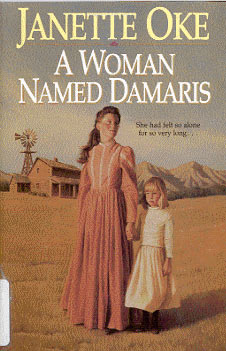
We shall now consider a few front covers in detail. The front cover of the novel A Woman Named Damaris is a simple front cover in the sense that it presents two characters in the back drop of and environment which is single and which appears to be a part/backdrop of the event in which these characters appear. I would call it a single event - single backdrop - simple characterization front cover. And yet the front cover poses great many difficulties to a discerning viewer to locate its placement in the verbal narration inside the book.
The "woman" portrayed is Damaris; but she has at least three homes of her own (if we do not include her lodging in Mrs. Stacy's):
- Damaris in her parents' home/farm until her running away from that place
- Damaris in the shack - the Rudding's home, and,
- Damaris in Gil's farmhouse.
The home under item 1 is the scene of action in the initial part of the story. A very dramatic turn in the novel relates to Damaris' running away from home. However, there were no children around, in that part of the story, which ran up to the 26th page. There were woods close by. Damaris slipped through the woods, determined to leave her home unable to bear the torture and misbehavior of her drunken father towards her mother. The fact that there were no woods shown in the visual and there were no children around in this part of the story takes us to the next home.
The little girl in the visual does not indeed appear until page 165 in a novel of 209 pages, and "the simple shack on the edge of town (item II) not until page 176. The shack is described as having whining hinges, as a run-down dwelling, with a pump in the yard.
The description of Gil's home (item 3) is done as follows:
As they topped the last hill, Damaris saw a neat yard with a barn and corrals off to the left and a trim little unpainted house tucked against a stand of trees on the right. Damaris let her eyes travel from the outdoor pump to the small vegetable garden to the hammock stretched lazily between trees. (Page 213)
Note that this description does not suit the visual and thus we are left with only one choice to locate it as item (2). Gil's home is described more from within than from without:
Damaris was surprised when she entered the house. It was bigger then it looked from the outside. In fact, it contained four rooms, one of them used as storage. The kitchen was roomy, though not large. A small cupboard sat snugly�Damaris took in every detail of the room and then crossed to the next, the living room...Damaris walked on to the bedroom at the back. It was another simple room.
There are more details of the inside of the house.
And yet there is no specific mention of the windmill any where in the novel as part of the description of the Ruddings' home nor there is a mention of the hills which you cross when you reach Gil farm, the farm of the boy who shows his concern both for Damaris and the orphaned children of Ruddings - "as they topped the last hill", "right over that next hill." In other words, the artist makes use of the explicitly mentioned environment relating to Gil's home or the portrayal of the environment of Rudding's home, which the writer was not interested much in describing.
For the writer, the whining hinges, run-down dwelling and that pump in the yard were more than adequate as a description of that shack because the utter poverty and emaciated conditions of the living organisms, namely, the children and Mrs. Rudding had to be given a pointed focus in the verbal narration bring out the emotive elements. She chooses a few select lexical items, and exercises parsimony in the description of the shack, because the word shack speaks for itself. What is more important for her is to bring out the isolation - social and geographic - of the Ruddings from the town. For the writer the fact that the Ruddings' home was in the edge of the town was more significant. In her scheme of things "the edge" portrayed both the physical and social isolation form the other inhabitants of the town, and cognitive aloofness, the loneliness and the suffering of Mrs. Rudding and her little ones in the hands of her drunken husband.
On the other hand, the artist views the house in the backdrop of the hills, which signify closeness to Gil's home where the future of the orphaned children and Damaris herself lies. That the artist is motivated by a futuristic perception, a well - being, is clearly revealed in his choice to portray that shack, after it was brought to a livable condition - the fiction also implies that Damaris and the little ones were together in the "shack" only after it was restored.
An explicit addition to the landscape was a windmill by the artist, something that the author had not mentioned, but was seen by the artist as befitting the environment. But, then the whole frame of event as portrayed in the front cover was not mentioned in the narration at all - Damaris looking in one direction (something that she left behind in her life?) and Abbie, her "adopted" baby looking in another direction (looking towards future in all smiles - compare the child's look with the reflective look of Damaris), and Damaris and Abbie together in the foreground of the shack that is restored - no description and no narration in the author's work.
The artist creates his own episode by bringing these two characters in postures perceived by him, in a backdrop, which could be recognized as the one written by the author. Even the backdrop assumes a different function in the artist's hands - addition and transposition, apart from creation, mark the entire front cover. Literal faithfulness is accepted only to the extent that it helps identification but not for the reproduction of a scene. Thus, not only the visual but also the episode represented by the visual is the creation of the artist. Note, however, that the artist's creation is not in opposition with the writer's narrative in this front cover. Faithfulness gets a different connotation in this coverage. The artist takes liberty to be free and even creates his own episode, but his freedom, rather the exercise of his freedom, is well within the possibilities of the author's narrative domain. In a way, the author's domain is flexible enough here to allow such creative additions by the artist.
The artist had a choice of at least three homes for his visual, and three consequent episodes. He chose one, and why? Although "the little ones" appear almost at the end of the novel, the whole story is about one's reconciliation with the past and not allowing the past to get repeated in the present, Damaris' determination not to get her past repeated in the lives of little ones. The story is also about restoration, not to hang on to the anger of the past but to overcome it with God's love.
The title certainly is A Woman Named Damaris, not A Girl named Damaris. The first is the home of a girl named Damaris; on the other hand, the second is the home of a woman named Damaris. The home of Gil which Damaris would take as her own home, however, is elaborated from within, and not from without. Here lies the clue - the artist had to choose a person and a moment that fully reflected the soul of the novel.
24. DAWN OF THE SIGNIFICANCE OF THE FRONT COVER
Note that the processes of deduction outlined above make one thing clear - the front cover does not require a serious viewing in order for one to retrieve its meaning. A reader can retrieve its meaning only after or during the actual processes of reading the content. Until that stage, the visual in the front cover has only a nominal, a bewitching function - to detail the content of the book in some syncretic and empathic manner for the benefit of a prospective buyer/reader. After reading and/or during reading, the visual takes on a different meaning to the reader. The events are ordered, the characters identified, and the skill of the artist, in relation to the content of the book, identified, appreciated or deprecated. Deprecated if there is gross violation, less matching of the sensibilities between the visual and the verbal narrative. Relished when appropriate distortion is made.
An episode in verbal narration is dynamic, whereas a visual is "frozen" in some sense. The "frozen" visual is to be given dynamism in its external appearance as well as in its internal structure, and linkage with all that matters in that episode. Naturally the artist sees what is relevant from his perspective of the situation, or he may create his own episode mixing several situations of the verbal narration together, to bring out his own episode and his own interpretation. Creating his own episode seems to be an important, if not a dominant, characteristic of Dan Thornberg.
23. ADDITION AND TRANSPOSITION
What we noticed as a chief characteristic of the front cover of A Woman Named Damaris could be identified in several others. The front cover of The Lady of Stonewycke is also a simple cover in the sense we have defined the front cover of A Woman Named Damaris. The front cover of Stonewycke presents (I) a landscape, (II) a lady prominently occupying the major part of the cover, and (III) a castle/house in smaller proportion in the landscape far behind the lady sitting on a rock (?). The cover presents also colorful flowers on the ground before the lady. "In a certain manner of speaking�Stonewycke Castle is the only house in town. Leastsways, the most important. Been that way for over three hundred years".
Joanna is there in Stonewycke in Scotland to find out her ancestry, which is somehow linked to the Laird of that castle. The story revolves around Joanna Matheson and her roots in an aristocratic Scottish family. Naturally, then, the front cover chooses to portray both the castle, and Joanna. But is there any basis for the episode in the novel as portrayed in the cover? Or is it a single event that is portrayed in the cover? Or is it a single event that is portrayed? Or is it the creation of the artist's imagination?
A close analysis of the verbal narration shows that there is no episode exactly identical to the visual in the verbal narration. The castle is described, the grounds are described, and even the flowers and the expanse behind the castle are described. Chapter 11 which describes the "house" reports Joanna's first encounter with the castle and its environment:
After rounding a projection in one of the walls she came upon a grassy area extending from the house toward the hedge. It was so pleasant, like a miniature well-tended meadow, that for a moment she almost forgot the awesome castle on her other side. Neatly pruned azalea and rhododendron bushes bloomed with bright splashes of lavender and orange and vermilion. Rose bushes clung to the black stone of the house, and their red pink buds heartened Joanna with a spirit of newness and hope (p. 70).
In a way, the geography, which is well represented in the front cover, can be linked to the description quoted above. And yet Joanna in this geography of grassy expanse and flowers is endowed with a spirit of newness and hope, and not with loneliness, despair, and confusion. While the geography is from the description given in Chapter 11 "The House", the portrayal of Joanna in the posture depicted comes from chapter 31 "Communion". The event and the posture and the mental frame of Joanna do not take place in the Castle grounds - but this event is the most important in the life of Joanna. For Joanna realizes at that moment that she has "accepted" His forgiveness and that He has cleansed away the guilt which, "has clung to my soul since before I can remember." But now it seemed something more was required of her before she would be able to hear His voice telling her what she was to do next." (p. 183).
See the above passage with what immediately precedes it in pages 182-183.
On top of the little peak, Joanna stared at the valley beneath her. The Cuttahay farm stood a mile away. To her right she could barely make out the outline of Stonewycke Castle. Port Strathy lay at the ocean's edge two miles distant between the two.
"It all comes down to this," she thought. This valley�this land.
She had come here on a vague quest with nothing but an old woman's words, and a few antique relics - no friends, no prospects, hardly even a future. Now it seemed she had more than she bargained for, more than she was prepared to handle.
She sighed again.
What was she to do? (p. 183)
What the artist has done is to portray the mood of the Communion chapter in the backdrop geography of the House chapter. In this process Dan Thornberg has created his own episode in the visual medium. Note that the process we noticed in A Woman named Damaris, a front cover of 1991, is noticed also in The Lady of Stonewycke, a front cover of 1986. It will be interesting to study in depth the patterns of such transposition in relation to the theme, the title, the content, the complexity of the visual mix, and perhaps the year of the front cover.
24. THE PROCESS OF EXTRACTION
From the addition and transposition, we move over to extraction in Vienna Prelude.
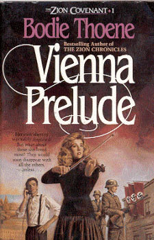
Elisa in her violin-playing posture is the dominant visual here. There are also four other little episodes portrayed: (I) Vienna, (?) in the background, at one end fading out; (II) Murphy on the phone listening; (III) Nazi soldiers looking around and searching; (IV) the Gestapo building (?).
Each of these exists in its own right, and is an extraction from the story. They are not part of a single event, nor are they presented to look like a single event; in addition, they are not presented as events playing a background function to one another. And yet together they from a syncretic whole and highlight the characters and the feel of the story. None of these is a specific incident in the verbal narration, significant in themselves to be portrayed, but all these find a place because together they give us the feel of the story, a sense of tension, suffering, terror, and a view of a young woman in distress and a young man seemingly involved in some sense in her life and in the story.
The dominant visual (a young woman in a violin playing posture) portrays Elisa who is a violin player in an orchestra, third chair among the first violins. She is here shown as playing in no environment, indeed an environment all her own, removed from all possible physical backgrounds. It could be a focus on her in a variety of incidents (performances) of violin playing within the novel. No particular incident, thus, is on focus here. It is Elisa and her mood, and her character/personality as a woman that is on focus here. One would very much like to assume that what is portrayed in the front cover is Elisa's playing of the violin as "a final defiant gesture" in her home in Berlin before she and her father left Berlin, (rather were trying to escape the tyranny of the Nazis):
It was final, defiant gesture - on which Elisa could not finally understand, and yet she obeyed. She closed her eyes and began to play. The strong voice of Rudy's precious violin reached every corner of the old house and floated out through the open window to where the men waited for some transgression of the new German law. She swayed with the sweet, clear melody, playing for her father and the old house, and -- for the last time -- for Berlin" (p. 62).
Note that the artist, in consonance with the writer, does not see Elisa as yet another violin hand in orchestra. The artist extracts the spirit of the personality, presents her as a violinist in her own right and in the mood of a woman (observe the fear and confusion in her eyes) who is harassed by the anti-Jew campaigns. With no clue to the physical environment, the visual becomes an extraction of the essence and its portrayal in a neutral canvas. The same conclusion holds good for the other episodes within the same cover.
26. MORE THINGS TO LOOK FOR AND STUDY
We have many more things to look into, and study in depth. For example:
- The event line in the panoramic front covers needs some special scrutiny. These panoramic front covers are designed in opposition to single-event front covers of the type in A Woman Named Damaris or even Vienna Prelude, which occupies a position between the single event and the panoramic event types of front covers.
- Or consider the interior monologue front cover (as in A Place Behind the World) as a separate category. The artist here makes an attempt to visually represent an interior monologue - no bubble is used; a different form is used here. Representation of the event line interior monologue, I believe is a difficult but aesthetically a rewarding experience both for the artist and the viewer. A spectrum of possibilities is presented by this form, and one hopes to see exploitation of these possibilities in future covers.
- Or consider specifically the covers of stillness as opposed to the cover of mobility (for example, the photo from stillness covers of several of Janette Oke's novels and Journals of Corrie Bell Hollister in relation to other covers as those found in Zion Covenant.)
- Apart from the stillness and mobility (movement/dynamism), we should consider the variety of looks, in particular, the facial angles that go with these looks.
- A number of front covers reveal the preoccupation of Dan Thornberg with angles and angular placements. While the angles and angular placement of characters as revealed in their angular looks give a distinct sense of search, a yearning and an expectation, even as these add to the beauty of the casuals and character representation, one would like to ask a question: Is it the artist's intention to develop further this angular positioning as a style of his own? What indeed is the relationship between stereotyping and style? What indeed is the relationship between stereotyping and creativity? How does one overcome the easy-to-acquire stereotyping characteristic and change that into a true creative style? What indeed is the way out? How does a deliberately worked out strategy of variety help further improve and enhance the value of the artist as an artist? Should an artist not repeat at all what he did in one front cover in another front cover? Is it not a fact that stereotyping of faces and figures is more easily avoided by modern methods of doing artwork through models, using photography? And yet stereotyping always would lurch in the dark in the other departments of the same artwork. We should be aware of this possibility.
- Literalness of the casuals is one area that connects the visuals with the title and the verbal narrative zones of communication. This literalness of the visuals needs to be further explored. For example, the literalness we find in the front covers of With This Ring and Wedding Dress is quite direct whereas the literalness in other front covers seems to be falling under several categories.
There are many more things, which await a discerning viewer of Dan Thornberg's Bethany covers. In identifying and enjoying all these, however, the verbal narrative (the content and forms of expression, the episodes and the "espirit") will continue to be the point of reference. The dialectic between the writer and the artist, -- in other words, how the artist tries to liberate himself from the binding cord of the writer shall be the focus.
*** *** ***
TELL ME IT'S TRUE... A Book Of Poems | INTO THE LIGHT ... Sigmund Brouwer's Out of the Shadows | WHITHER KARMA? GLORY OF THE BLUE COLLAR - WHITE COLLAR GOD | CLEVER THIEVES AND SMART ROBBERS: SHOULD WE ADMIRE STEALING? | WHY INCLUDE THE CHRISTIAN ARTS IN WORSHIP - A Caymanian Perspective | HOME PAGE | CONTACT EDITOR
Madasamy S. Thirumalai
Bethany College of Missions
6820 Auto Club Road, Suite C
Bloomington, MN 55438, USA
E-mail: thirumalai@bethfel.org.